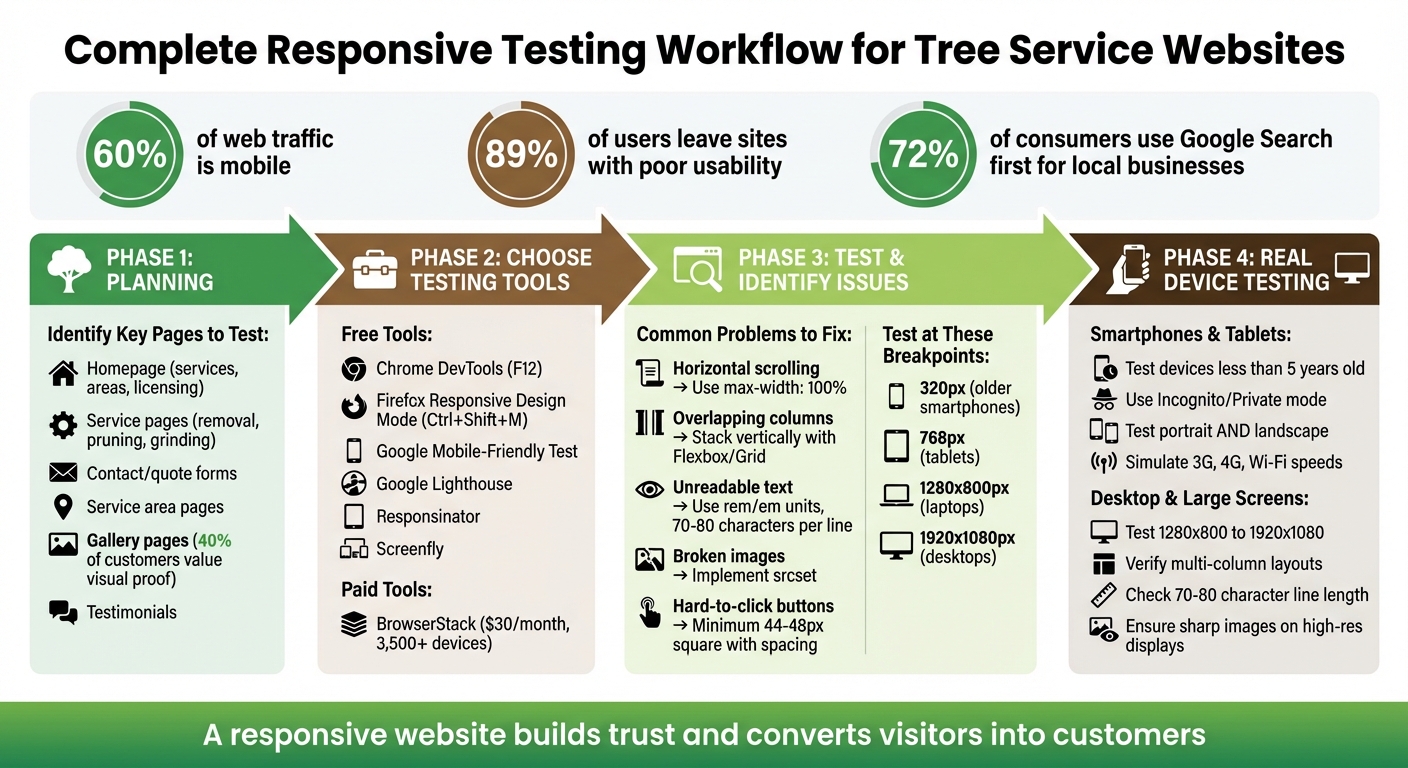
Your tree service website must work well on any device. Why? Mobile traffic accounts for nearly 60% of all web visits, and 89% of users leave websites with poor usability. Plus, Google prioritizes mobile-friendly sites in search rankings. If your site isn’t responsive, you could lose customers and visibility.
Here’s what you need to focus on:
- Key Pages: Test your homepage, service pages, contact forms, and testimonials to ensure they display correctly on all screen sizes.
- Testing Tools: Use free tools like Chrome DevTools or Google’s Mobile-Friendly Test for quick checks. For deeper insights, consider paid tools like BrowserStack.
- Common Issues: Fix problems like horizontal scrolling, unreadable text, or buttons that are too small to tap.
- Real Devices: Simulators are helpful, but testing on actual smartphones, tablets, and desktops ensures accurate results.
Responsive design isn’t just about looks – it’s about creating a smooth experience for visitors. A mobile-friendly site helps you retain customers and rank higher in local searches.
Complete Responsive Testing Workflow for Tree Service Websites
How to Test if a Website is Responsive and Mobile Friendly – Quick and Easy
Planning Your Responsiveness Testing
To ensure a smooth user experience, start with a well-thought-out plan. Focus your testing efforts on pages that directly impact leads and revenue.
Identify Key Pages to Test
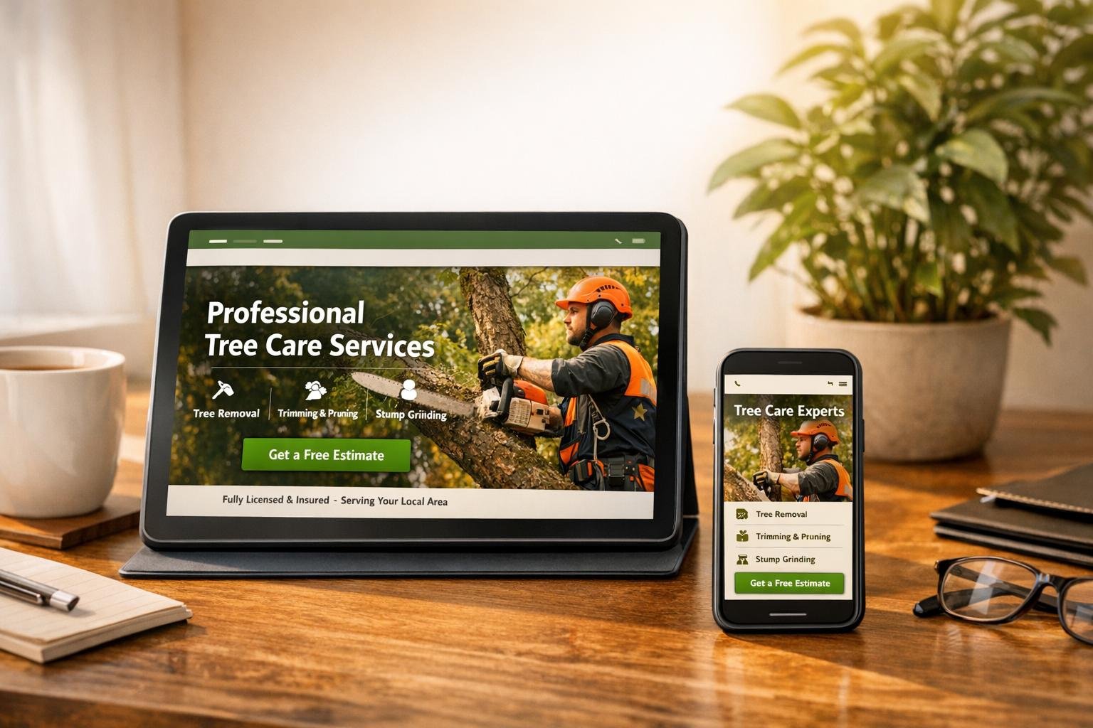
Your homepage is often the first impression visitors get. It needs to clearly showcase your services, service areas, and trust-building elements like licensing and insurance details – across all screen sizes. Visitors should instantly understand what you offer and where you operate.
Take a close look at your service pages, whether they cover tree removal, pruning, stump grinding, or emergency assistance. These pages must be easy to read and navigate on mobile devices. Don’t forget to test contact and quote request pages – these are your conversion hubs. If a call button isn’t functional on a smartphone or a form is tricky to fill out on a tablet, you’re likely losing potential customers.
Service area pages play a key role in local SEO. These pages should display maps and local contact details correctly on any device. For gallery pages, make sure before-and-after photos are clear and scale properly without slowing down the mobile experience. Remember, 40% of customers value visual proof like this. Lastly, check your testimonials and reviews pages to ensure they remain visually appealing and accessible on different screen sizes.
Once you’ve identified the critical pages, it’s time to select the right tools for testing their responsiveness.
Gather Your Testing Tools
With your priority pages outlined, choose tools that help you evaluate performance across a variety of devices.
Start with free options like Chrome DevTools and Firefox Responsive Design Mode, which let you simulate different device resolutions and orientations right in your browser. For more extensive testing, consider BrowserStack, which offers access to over 3,500 real devices and browsers, with plans starting at about $30 per month. Use Google’s Mobile-Friendly Test and Google Lighthouse (available in Chrome) to assess technical responsiveness, SEO, and accessibility. Tools like Responsinator and Screenfly can also resize your viewport to match popular device dimensions.
"The best way to test your website and its responsiveness to screen size on different devices is to use the actual devices." – Tom Homer, Software Developer, eSilverStrike
While browser tools provide a quick way to check layouts, testing on real devices ensures touch functionality and performance are up to par.
Using Browser Developer Tools to Test Responsiveness
Browser developer tools make it easy to simulate how your tree service website will look on different devices – without needing physical hardware. Both Chrome and Firefox have built-in features that allow you to check how your site appears on smartphones, tablets, and desktops, all from the comfort of your computer.
How to Test with Chrome DevTools
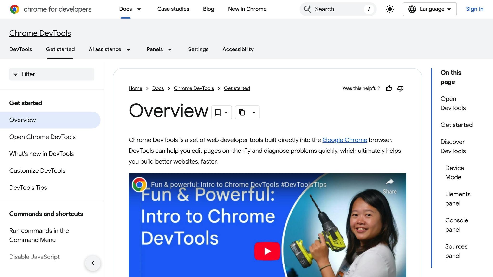
To open Chrome DevTools, press F12 on Windows/Linux or Cmd+Option+I on Mac. Alternatively, right-click anywhere on your webpage and select "Inspect." Once DevTools is open, click the Device Toolbar icon (it looks like a smartphone stacked on a tablet) to enable simulation mode.
From here, you’ll notice a "Dimensions" dropdown menu. Set it to Responsive to manually adjust the viewport size by dragging its edges or entering specific pixel dimensions. You can also select preset devices like iPhone, Samsung Galaxy, or Pixel, or input custom dimensions. Need to test orientation? Toggle between portrait and landscape modes as needed.
Make sure to test your site at 320px wide, as some older mobile devices still use this resolution. For performance testing, use the Throttle dropdown to simulate slower network speeds like "Mid-tier mobile" or "Low-end mobile." This feature is especially useful for checking how quickly your tree service photos or contact forms load on slower connections. Keep an eye on the Console tab for any JavaScript errors or unexpected layout shifts at different screen sizes.
Firefox also offers similar tools for responsive testing.
How to Use Firefox Responsive Design Mode
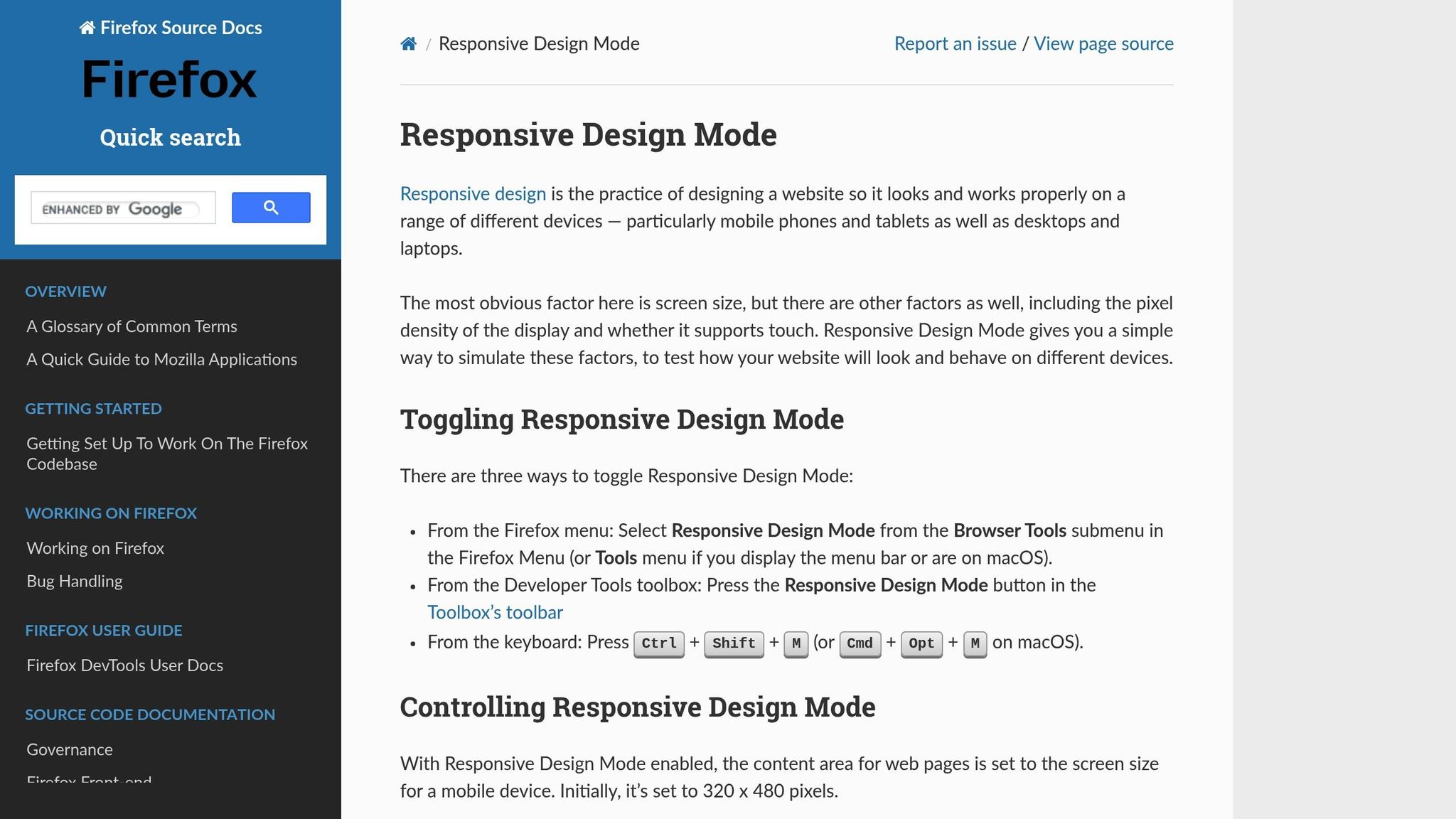
Firefox provides its own user-friendly tools to test responsiveness. To activate Firefox Responsive Design Mode, press Ctrl+Shift+M on Windows/Linux or Cmd+Opt+M on Mac. You can also access it through the Firefox menu under Tools > Browser Tools > Responsive Design Mode.
The default viewport starts at 320 x 480 pixels, but you can resize it by dragging the bottom-right corner or entering exact dimensions. For precise adjustments, use the arrow keys to change the size by 1px at a time, or hold Shift to adjust in 10px increments. You can also select specific devices from the dropdown menu to mimic their screen size and pixel density.
Click the touch simulation icon (a hand with a pointing finger) to turn mouse clicks into touch events. This lets you verify that your buttons and forms are fully functional for mobile users. Firefox also allows you to simulate different connection speeds, such as 2G, 3G, or LTE, giving you a clear picture of how your site performs under varying conditions.
"As we build new sections or layouts, it’s often quickest and more sustainable to check those as you go rather than wait until the entire site is built." – FreshySites
After enabling touch simulation or changing the user agent, make sure to reload your page. Many websites only detect touch support during the initial load, so reloading ensures accurate testing. Regularly refreshing the page also helps maintain consistent conditions across all device simulations.
Using Online Tools to Test Mobile-Friendliness
While browser developer tools are great for quick checks, online tools dig deeper, uncovering issues that might otherwise go unnoticed. These automated tools evaluate your tree service website’s mobile usability and flag technical problems that could impact user experience and search engine rankings. They work hand-in-hand with manual checks, ensuring no mobile issue slips through the cracks.
Google Mobile-Friendly Test
Google’s Mobile-Friendly Test is a free and straightforward tool for assessing your website’s mobile usability. Just drop your URL into the tool, and in seconds, you’ll get a pass/fail result along with a preview of how your page looks on mobile devices. It evaluates key factors like viewport settings, text readability, spacing of touch elements, and whether content fits the screen without horizontal scrolling.
The tool scores your site on a scale of 0 to 100, with a minimum score of 80 required to pass. However, aiming for a perfect 100 can significantly enhance the user experience. A study of over 4,000 pages revealed that nearly 83% of sites faced issues with "Size and Proximity of Links." Font readability problems were found to lower scores by up to 40 points, while inadequate spacing for tap targets could cost up to 30 points. To avoid these pitfalls, ensure critical buttons like "Call Now" or "Get a Quote" are at least 48 pixels square. Don’t forget to review footer links and pagination, as they’re often overlooked. When testing updates, use Incognito or Private browsing mode to make sure you’re viewing the latest version of your site rather than a cached one.
Using Responsinator
Responsinator is another handy tool that shows how your site looks on popular devices in both portrait and landscape orientations. Simply enter your URL, and you’ll instantly see how your site appears on iPhones, Android phones, and tablets. It highlights design layout issues that might affect usability.
This tool is particularly helpful for checking whether visual elements like service galleries, before-and-after photos, or contact forms retain their intended layout across devices. With mobile devices accounting for 51.53% of global website traffic in the second quarter of 2020, ensuring your site performs well in all orientations is crucial. Key interactive elements must remain functional and accessible, regardless of the device being used.
sbb-itb-130a704
Common Responsiveness Problems and How to Fix Them
When you use tools to identify responsiveness issues, you’ll likely encounter several common challenges. These tools often highlight layout and usability problems that can frustrate users and hurt your website’s search rankings. For example, horizontal scrolling is a frequent issue on tree service sites, making navigation clunky and discouraging visitors. Considering mobile devices are projected to account for over 60% of web traffic by 2025, addressing these problems is crucial for attracting new customers.
One issue is navigation menus that don’t adapt well on tablets, leading to awkward wrapping before the mobile menu kicks in. Similarly, service galleries showcasing before-and-after photos may display unevenly, with gaps or overlapping images caused by poorly configured grid layouts. Another common headache is image overflow – high-resolution photos of tree equipment or job sites can extend beyond their containers, pushing other content off-screen. To fix this, include the viewport meta tag in your HTML and use CSS to make images scale properly:
<meta name="viewport" content="width=device-width, initial-scale=1.0"> And in your CSS:
img { max-width: 100%; height: auto; } Let’s break down some of these common issues and their fixes.
Setting Viewport Breakpoints and Adjusting Layouts
Configuring breakpoints for different devices is essential for responsive design. Breakpoints are specific screen widths where your layout adjusts to fit various devices. A mobile-first approach works best: start with styles for smartphones, then use @media queries to tweak layouts for screens wider than 768 pixels. For scalable layouts, rely on relative units like percentages or rem instead of fixed pixel values.
"Responsive web design isn’t a single technology – it’s a set of techniques and principles that work together to make websites adapt to different screen sizes, resolutions, and devices." – Laura Coronel, Treehouse
Always test your design at widths as narrow as 320 pixels, as some older smartphones still use this screen size. Multi-column layouts that look great on desktops should stack vertically on smaller screens to keep text readable and user-friendly.
Improving Touch Targets and Button Usability
Interactive elements like buttons need to work well on touchscreens. Ensure buttons such as "Call Now" or "Request a Quote" are large enough – ideally 44-48 pixels square – with sufficient spacing to prevent accidental taps. Use CSS media queries to adjust button dimensions and spacing for mobile while maintaining a consistent appearance on desktops.
"Interactive elements are touch-friendly, with properly spaced and sized buttons." – BrowserStack
Chrome DevTools’ Device Mode can help you simulate touch interactions by displaying your cursor as a fingertip-sized circle, making it easier to evaluate button usability. Testing on actual devices is also vital for ensuring accuracy.
Making Fonts Easier to Read
Fixed font sizes can hurt readability, especially on smaller screens. Instead, use rem or em units so fonts can scale fluidly with screen sizes. Without the right viewport meta tag, mobile browsers may inconsistently enlarge font sizes, creating a cluttered look.
Aim for text columns with 70 to 80 characters per line for better readability. On larger screens, limit content width to prevent lines from stretching too far. Additionally, use minor breakpoints to slightly increase font sizes for viewports over 360 pixels, ensuring text remains legible even on smaller devices. Don’t forget to add enough padding around your text to avoid words being cut off at the edges.
| Layout Issue | Solution |
|---|---|
| Horizontal Scrolling | Use max-width: 100% and avoid fixed pixel widths |
| Overlapping Columns | Use Flexbox or CSS Grid to stack columns vertically on smaller screens |
| Unreadable Text | Use relative units (rem/em) and adjust line heights for mobile |
| Broken Images | Implement srcset to serve optimized image sizes for different devices |
| Hard-to-Click Buttons | Increase padding and spacing for touch targets to at least 44×44 pixels |
Testing Responsiveness on Actual Devices
While browser tools and online simulators can offer some insights, nothing beats testing your tree service website on actual devices. Real-world testing reveals how your site performs under authentic conditions, such as varying network speeds and real touch interactions. With 59% of all web traffic now coming from mobile devices, ensuring your site works seamlessly on these devices is essential for attracting and retaining potential customers.
Different browsers, like Safari (WebKit) and Chrome (Blink), can render pages differently, leading to unique challenges. By testing on physical devices, you can catch these discrepancies and refine your site further. As Software Developer Tom Homer explains:
"The best way to test your website and its responsiveness to screen size on different devices is to use the actual devices. This allows you to not only test the actual sized screen, but how the internet browser itself that comes installed on the device, displays the page".
Real-device testing builds on simulated tests, confirming that your website adjustments hold up under everyday conditions.
Testing on Smartphones and Tablets
Start by testing on popular devices like the latest iPhones and Samsung Galaxy models. Focus on devices that are less than five years old, as they represent most active users. To ensure you’re seeing the most up-to-date version of your site, always use Incognito or Private mode during testing.
Check that key interactive elements, such as "Call Now" buttons, are easy to tap and that your layout adjusts smoothly in both portrait and landscape orientations without requiring horizontal scrolling. These small details play a big role in capturing local leads by providing a smooth user experience.
Test your site under different network conditions, such as 3G, 4G, and Wi-Fi, to evaluate how quickly images load and whether forms function properly. If your site is still in development, tools like BrowserStack’s Local Testing feature (starting at about $30 USD per month) let you test your site on mobile devices even if it’s hosted locally on your computer.
Testing on Desktop and Large Screens
While mobile testing is crucial, don’t overlook desktop and larger screen users. Many homeowners and commercial clients still research tree services on office computers or home desktops. Test your site across a range of screen sizes, from 1280 x 800 pixels (common on 13-inch laptops) to 1920 x 1080 pixels (standard for 23-inch monitors).
Ensure your multi-column layouts remain visually balanced and functional without stretching content too wide. Text columns should stick to 70 to 80 characters per line for easy readability, even on large displays. Check that service galleries look organized, navigation menus are accessible, and call-to-action buttons stand out without getting lost in excessive white space. Finally, make sure your tree service photos appear sharp and professional on high-resolution displays, avoiding any pixelation or distortion.
Conclusion
Responsive testing plays a key role in driving local leads and helping your business grow. By leveraging tools like Chrome DevTools, Firefox Responsive Design Mode, online platforms such as the Google Mobile-Friendly Test, and real devices ranging from smartphones to desktop monitors, you can make sure your website performs seamlessly for every visitor.
Why does this matter? The numbers speak for themselves: 72% of consumers turn to Google Search first when looking for local business information, and 89% of users leave websites after a poor experience. A responsive website that loads quickly, looks great on any screen, and allows users to easily interact – like tapping a "Call Now" button – builds trust and turns casual visitors into paying customers.
To get it right, focus on the details: ensure layouts work at 320px, touch targets are mobile-friendly, test both portrait and landscape orientations, and simulate different network conditions. As BrowserStack highlights:
"Inconsistent user experiences across devices can harm a brand’s reputation. Users expect smooth & reliable performance, no matter the device. Failure to meet these expectations can lead to dissatisfaction and lost customers."
By following these practices, you’re not just optimizing for usability – you’re building a reputation for reliability. When someone searches for emergency tree removal on their phone, your website’s seamless experience can make all the difference. It’s this level of care that positions your business as trustworthy and approachable, turning visitors into loyal customers.
Need more tips on improving your tree service website and capturing local leads? Check out the expert guidance from Tree Company Leads.
FAQs
What tools can I use to check if my tree service website is mobile-friendly?
Testing how well your tree service website performs across different devices is essential. A responsive site ensures a smooth user experience, whether visitors are browsing on a phone, tablet, or desktop. Here are some tools to help you evaluate your site’s responsiveness:
- Chrome DevTools: This browser tool lets you simulate various screen sizes and devices. You can test phones, tablets, and desktops, tweak screen dimensions, and even assess load times on slower network speeds – all without leaving your browser.
- BrowserStack: With this platform, you can check your site on a wide range of real devices and operating systems, giving you insight into how it performs on the same hardware your customers use.
- Free Simulators: Tools like Screenfly and Responsinator provide quick previews of your site’s appearance on different screen resolutions, and they don’t require any downloads or installations.
For the most reliable results, pair these tools with testing on actual devices or use native emulators like the iOS Simulator or Android Emulator. This combination helps ensure your website not only looks good but also works flawlessly for every visitor, regardless of their device.
Why is it important to test your website on real devices for responsiveness?
Testing your website on actual devices is crucial for gaining a true understanding of how it functions across different screens, browsers, and hardware setups. While simulators and emulators can be helpful, they often overlook important aspects like touch gestures, unique browser behaviors, or variations in rendering engines.
Real device testing allows you to ensure your site works smoothly for users, whether they’re on a smartphone, tablet, or desktop. It also helps uncover potential problems that might affect usability and the overall user experience.
How can I fix responsiveness issues on my tree service website?
To address common responsiveness issues on your tree service website, start by testing its performance across different devices. One handy tool for this is Chrome DevTools. Open your site in Chrome, right-click and select Inspect (or use Ctrl + Shift + I on Windows or ⌘ + Option + I on macOS). Once there, enable responsive mode by clicking the device toolbar icon or pressing Ctrl + Shift + M (Windows) or ⌘ + Shift + M (macOS). This feature lets you preview how your site looks on various screen sizes and orientations.
Pay attention to problems like horizontal scrolling, overlapping elements, or text that’s difficult to read. Fixing these issues often involves a few key steps:
- Use a viewport meta tag: This ensures your site scales properly on different devices.
- Switch to flexible layouts: Replace fixed dimensions with percentages or
vwunits for a more adaptable design. - Make images and videos responsive: Apply CSS rules like this:
img, video { max-width: 100%; height: auto; } - Implement media queries: Adjust styles for specific screen sizes. For example:
@media (max-width: 768px) { /* Styles for tablets */ } @media (max-width: 480px) { /* Styles for mobile devices */ }
After making these adjustments, retest your site to confirm everything works smoothly across devices. If tackling this feels overwhelming, consider reaching out to experts like Tree Company Leads, who specialize in creating mobile-friendly, lead-generating websites tailored to tree service businesses.